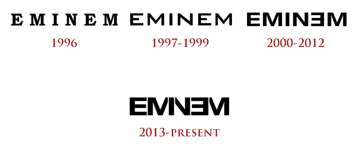
Text is the only detail of the logo since there is nothing else in it, apart from the stylized “E“ (Ǝ). Rocking a customized Helvetica Neue Bold Extended typeface today, it has always been composed of a simple all-caps wordmark in a monochrome palette (for the most part), and has seen the biggest change in 1997, to be only just slightly redesigned since. The main difference being the introduction of the reversed second E and the 2013 simplification that has seen some of the letters partially merged together, producing a considerably more compact and cohesive logo.
Here is the road of mentioned simplification and modernization that led us from Eminem to EMINƎM, and to the logo we know and love today.

Eminem logo evolution through time:
Eminem released his first album in 1996 and by 2000 he already became a world class star. Even though the Eminem trademark hasn’t been officially registered until 2004, he’s been using various versions of his logo on albums and merchandise ever since the first album release.
1996

Eminem’s first logo from 1996, as used on the Infinite album, was a rather simple text saying Eminem in a Bookman Old Style Bold serif font. It features thick, firm serif letters and is black on a white background. Its thick and bold lines make the otherwise simple logo appear strong and eye-catching, although somewhat dated.
1997 – 1999

In 1997 the Eminem logo was considerably redesigned, embracing the principles of minimalism and simplicity, as modern times would dictate. The old logo font was pretty much completely replaced as a new, flat and clean, sans-serif font was chosen, exhibiting wide traditional contours and distinct lines and cuts. The new logo was in a font much similar to the one used in logos later on, as such it looked readable and attractive, but still no stylized letters, like backwards turned “E“ (Ǝ), that Eminem becomes known for later, was present. The color scheme of the logo was either white or black, depending on the album covers background shade.
2000 – 2012

In 2000 a new album “The Marshal Mathers LP” was presented and the base of the current Eminem logo was created. The logo on it had a changed look; The new logo features a slightly altered font to that of previous years, the letters became more aggressive, and being somewhat bolder, with straight lines and sharp corners it highly resembles Helvetica Neue Bold Extended. The middle line in the “E’s“ is no longer shorter than the outside lines. The main detail of the logo became the second letter “E” which is now finally written backwards (Ǝ). This immediately became a unique and recognizable symbol of Eminem and has remained so until this day.
The color palette would for the most part also remain the same, but sometimes the backwards “E” would be colored red, which added energy and passion to the Eminem logo.
2013 – today

The latest Eminem logo, created in 2013 is the most original one. Being based on the previous version, it features the same typeface, size and color scheme, but the letters “M” and “N” of the nameplate lost one of their vertical bars.
The second “M” of Eminem and the “N” use the letter “I” to make up for the missing side bars, as such the “I” now serves as both “I” as well as part of the first “M” and “N”. In other words, the letters “M” and “N” are simplified to such an extent that they are each left without one of the sides, while the missing sides are replaced by the “I” located between them.
The vertical bar of the second mirrored “E” (Ǝ) also serves as a vertical bar of the second “M” that stands next to it, and the combination of all the shared bars creates a stunning visual effect that keeps you interested. This way, the letters are at a minimum distance from each other and the logo itself feels more compact and modern, while looking more like a logo and less like a pure text it used to be.
In terms of writing technique, they made the logo lighter, but at the same time added complexity in terms of visual perception.
According to the experts, the refined logo had reached the ideal look.
The first time this logo was used on a cover was the “The Marshall Mathers LP 2” album and has gone through several creative edits since.
The final version of the short logo has also been approved – the now famous letter “Ǝ” (reversed “E”), sometimes wrapped in a contrasting circle. The signature ”E” is used as a signifier or an icon and has since become instantly recognizable among most people on its own.

Current Eminem logo in white:

